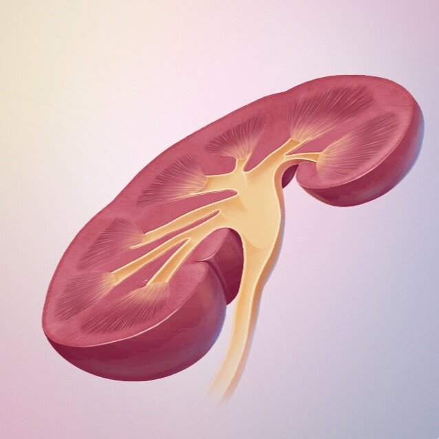
How Annie Campbell digitally painted this medical illustration of a kidney
Intro
In this medical illustration tutorial, Annie Campbell from Now Medical Studios shares her studio’s process for creating this kidney cross-section digital illustration.
Art fundamental tutorials
Listen to our Podcast
Illustration tutorials
“Hi friends, Annie here. Today I wanted to provide you a little glimpse into how we created this medical illustration of a kidney cross-section. Hope you enjoy it and that you're all taking care of yourselves. “
— Annie Campbell
Director and co-founder of Now Medical Studios⠀
Overview
Hi friends! Today we wanted to share with you our process for creating this kidney cross-section illustration.
We hope you enjoy this peek into how we work through things. Comment below if you have any questions, we'd love to hear from you!
STEP 1 SKETCH & FORM
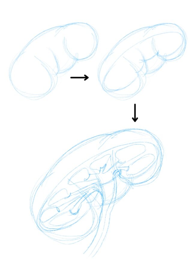
When drawing things in cross-section, we've always found it helpful to block out the full shape of the structure before adding in the cross-sectional planes. This helps with form building and avoids funky looking cross-sectional organs.
Once the structure is built, we can go in and add details of the cross-sectional plane.
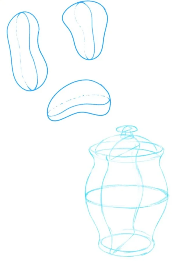
If you don't have much experience or are a little unconfident in your ability to draw things in cross-section, a great practice is to draw a bunch of blobs on a paper and try and split those in half.
Still life studies of hard surface objects are also useful to test your ability to draw and eyeball form correctly. Do lots of this sort of practice every day or every other day to level up.
STEP 2 LINEWORK
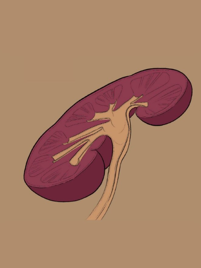
Once the form and proportions are looking good, we can then move on to implementing the final linework to our illustration.
We usually opt for a thicker outer line and thinner inner and detail lines. Here we played with the design of this image and added a dotted line to indicate the full organ shape. This was later dropped.
STEP 3 COLOUR BLOCK
The next step here is to block out the colours or hues that we want to use for this piece.
The hardest part here is to stop yourself from starting the rendering process. At this stage, we should focus on blocking out the lighting and figuring out which planes face the light and which planes face away from the light.
This stage is also useful to quickly work out colour combos.
STEP 4 RENDER
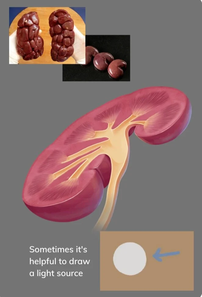
Now that you've done the hard work in figuring out your colour combinations and planes, you can start to render your illustration.
If you haven't done countless tissue studies in the past, trying to paint them from your mind is going to be challenging. Help yourself out by sourcing reference images for how certain tissues look in different lighting scenarios.
FINAL
Here's how the image looks in its final background. The way we structured the file meant that we can swap out the background easily or even save it on a transparent background.


